THE MACALLAN
M Copper
Retail Design Language
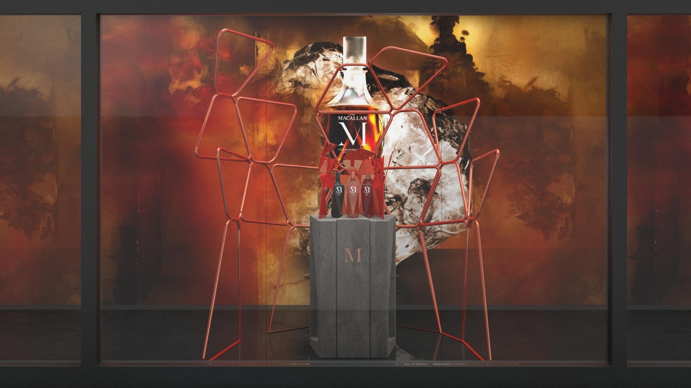
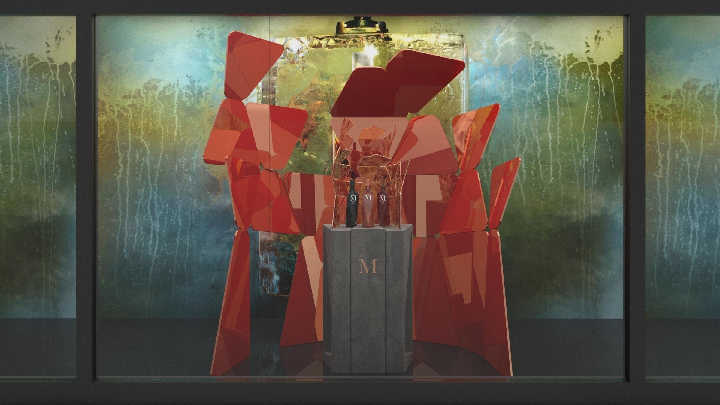
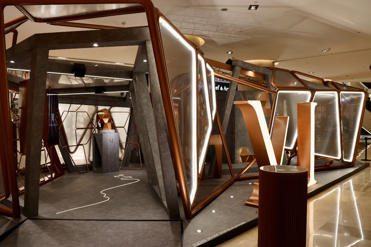
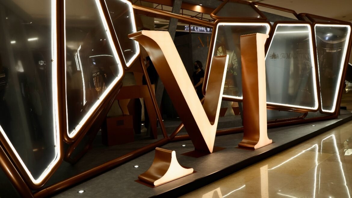
Applied to Displays, Windows, Pop-Up gallery
M Copper is an ode to the Curiously Small Spirit Stills that remain key to crafting The Macallan’s precious spirit to this day. One of the defining features of the distillation process, they represent a pivotal moment in whisky-making history as when most moved to larger, higher production copper stills, The Macallan focused on exceptional quality. Their distinctive shape and size help to concentrate the new make spirit, creating the rich, robust character.
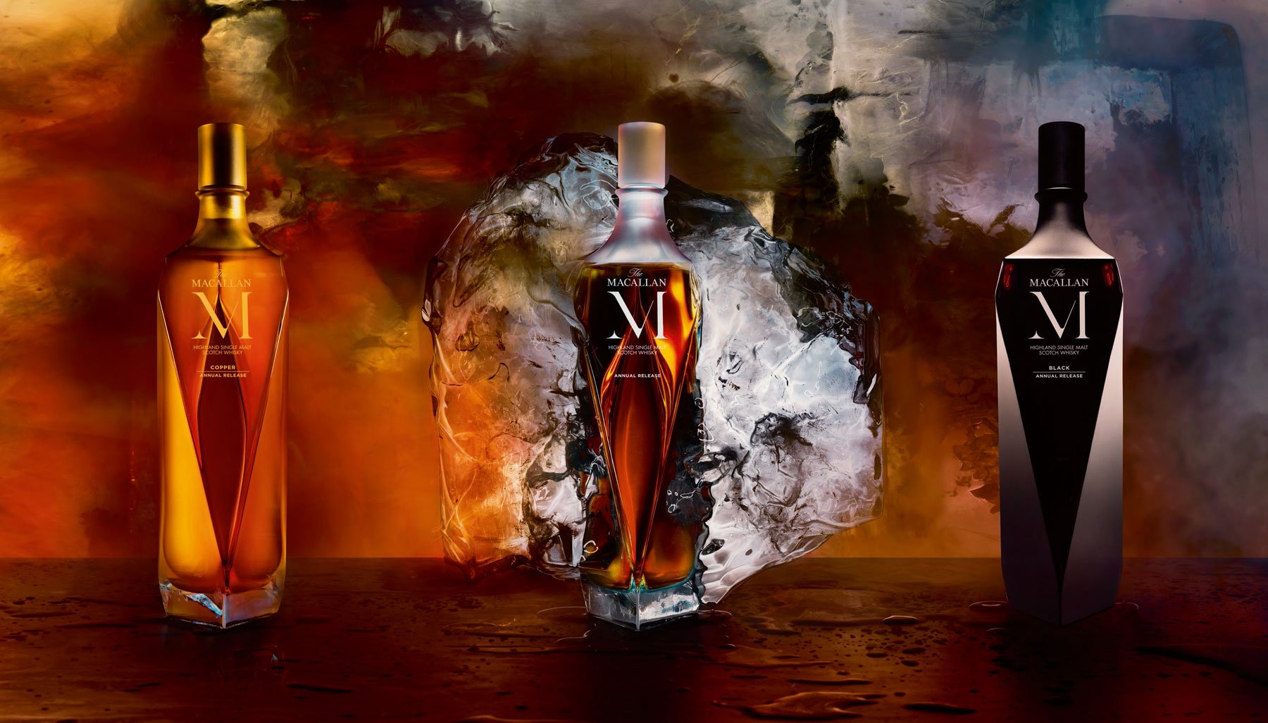
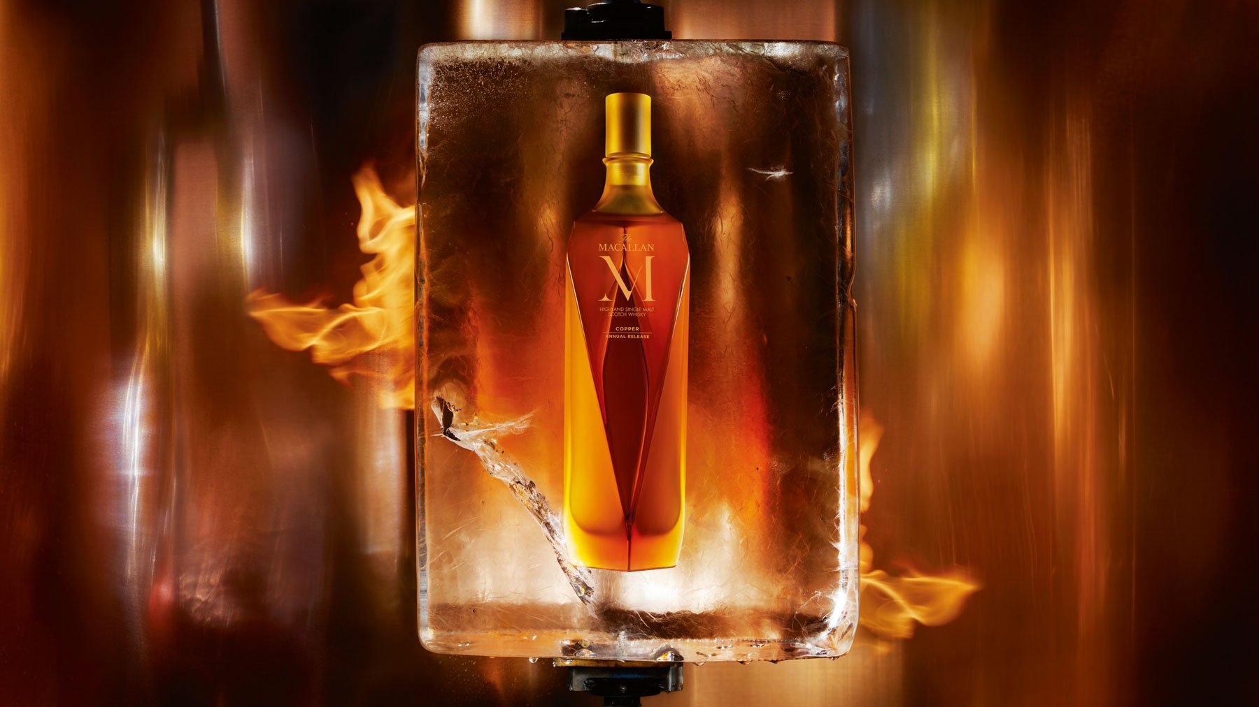
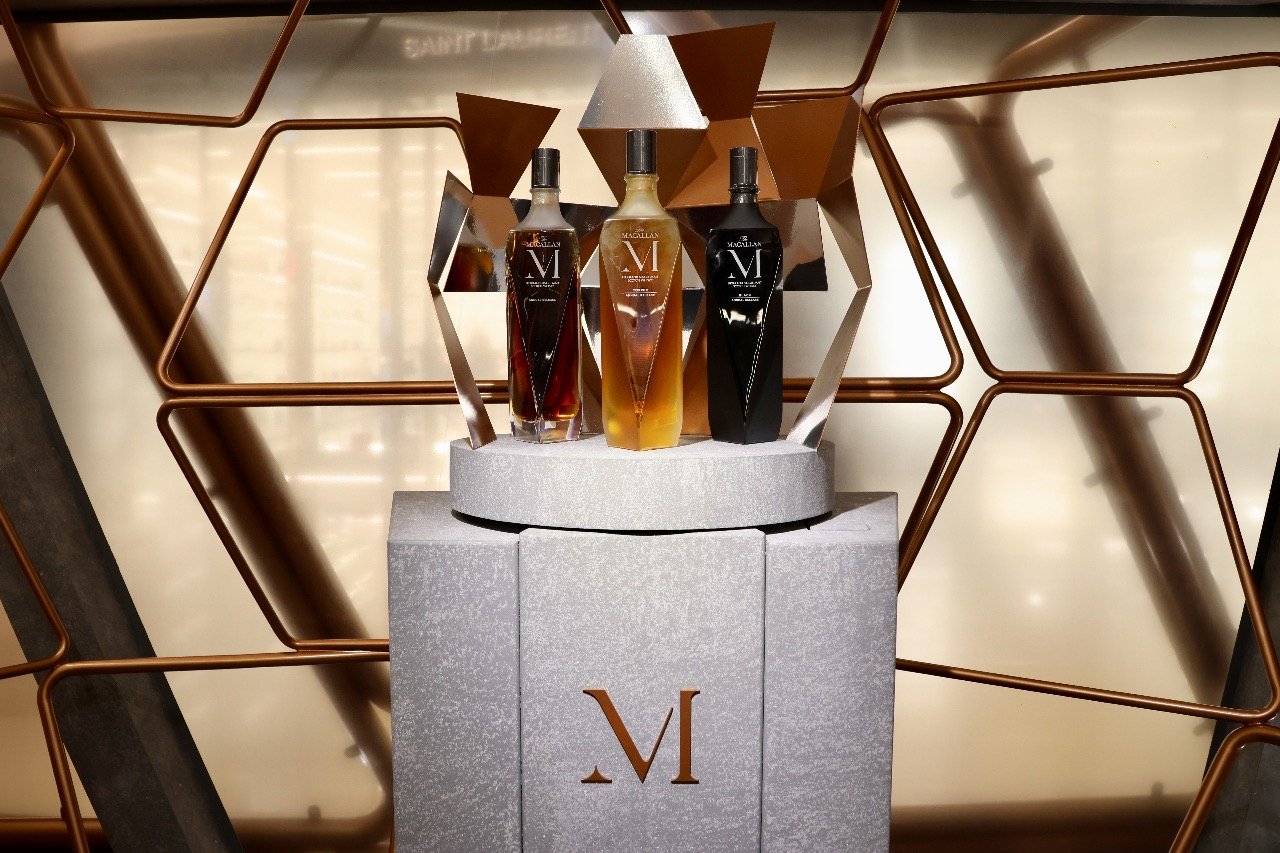
With a natural color of spun gold, M Copper is a vibrant and elegant expression which brings the flavors created in the stills to the fore. It has a buttery, viscous mouth coating and is bursting in fruitiness with a hint of sweet malty flavor. A handcrafted Lalique copper colored crystal decanter designed by Fabien Baron represents the stills and reflects the authenticity which drives the brand through its dedication to innovative methods. The campaign photography is by Nick Knight.
Behind the scene
• Design of retail language for M Copper based on Fabien Baron’s bottle design and Nick Knight’s photography
• Design of vitrines, podiums, merchandising units
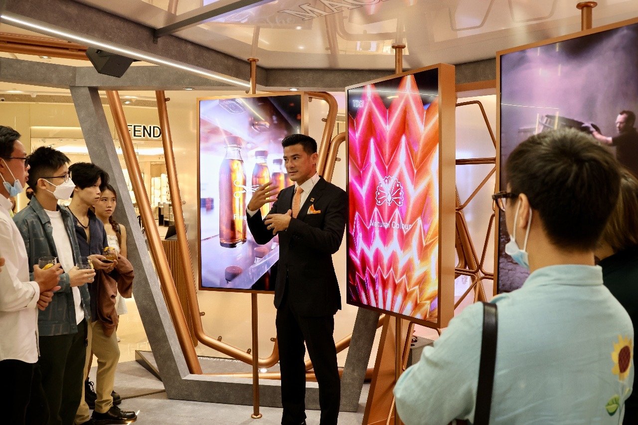
• Concept design for pop-up experiential boutique at Ion Singapore

